

Having a passion for typography, I often get asked questions like: why does typography matter? Or, what's the difference between putting text in Times New Roman or Baskerville? In a world where every detail matters, typography really can make the difference between a successful or unsuccessful brand.
“Just like our own handwriting, typography is an expression of our own character.”
Typography is often the first impression a customer gets from a brand, so it needs to be aesthetically pleasing as well as functional. Every typeface has a cultural, subconscious reference that we may not realise. This means letters tell us much more than simply the words they spell. The same word shown in two fonts may say the same thing, but the choice of typeface you use can give it a totally different meaning and ultimately determine what message you want to display. Just like our own handwriting, typography is an expression of our own character.
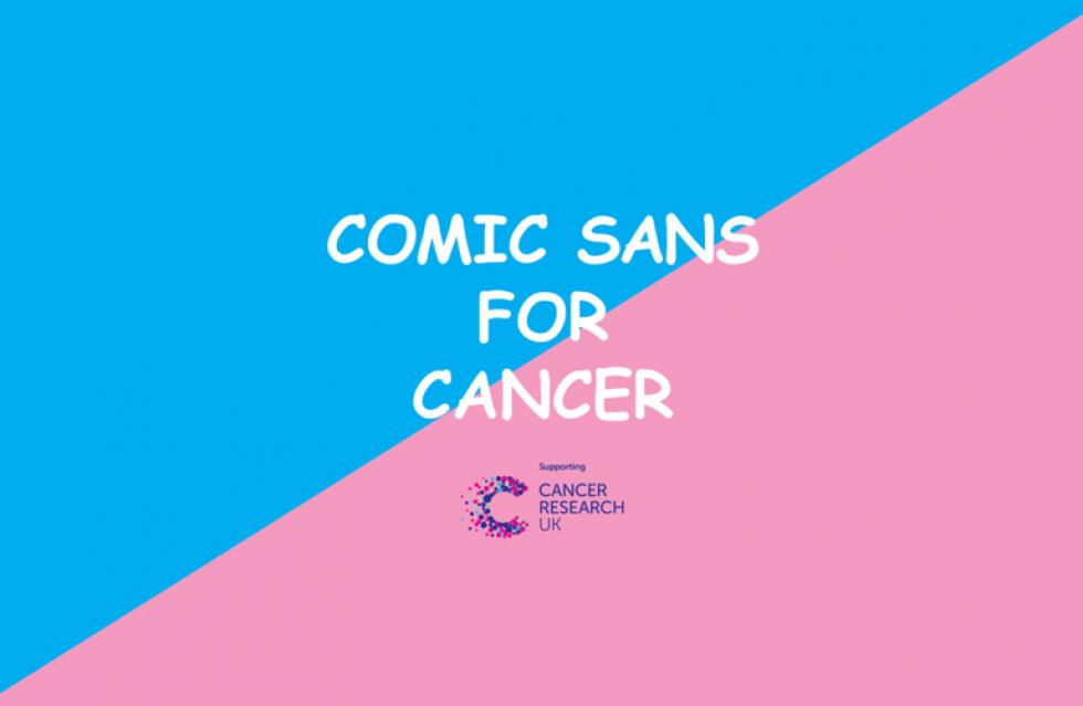
Comic sans is possibly one of the most hated fonts by designers; it gives an unprofessional effect to a product, with an overly informal style that most won't trust. However, when the font was used in a Cancer Research campaign it challenged the way we look at comic sans for positive effect. This is a great example of how typography used with purpose can evoke emotion and enhance a customer's experience, setting a product or campaign apart from competitors.
So how do you choose a good typeface?
“The difference between good typography and bad typography is the difference between work that looks professional, to work that looks like it's done on Word.”
- James PuckettTypefaces are largely an interpretation of historical fonts, borrowing the best bits from traditional, classic fonts. With a large choice of endless possibilities choosing one typeface for a logo is hard, as it needs to be aesthetically pleasing as well as functional. It's about finding the most successful outcome for the context, but not even the very best typefaces are suited to every situation.
The way I usually work is to start off with the brief. I'll explore what makes the product unique, the demographic of the client and the history of the people or place. I'll also explore what kind of meaning should be given to the copy and how it comes across in different mediums, weights and sizes, delivering consistent results both on screen as well in print. The end result becomes obvious, as if nothing else fits its place, expressing the brand to its full potential.
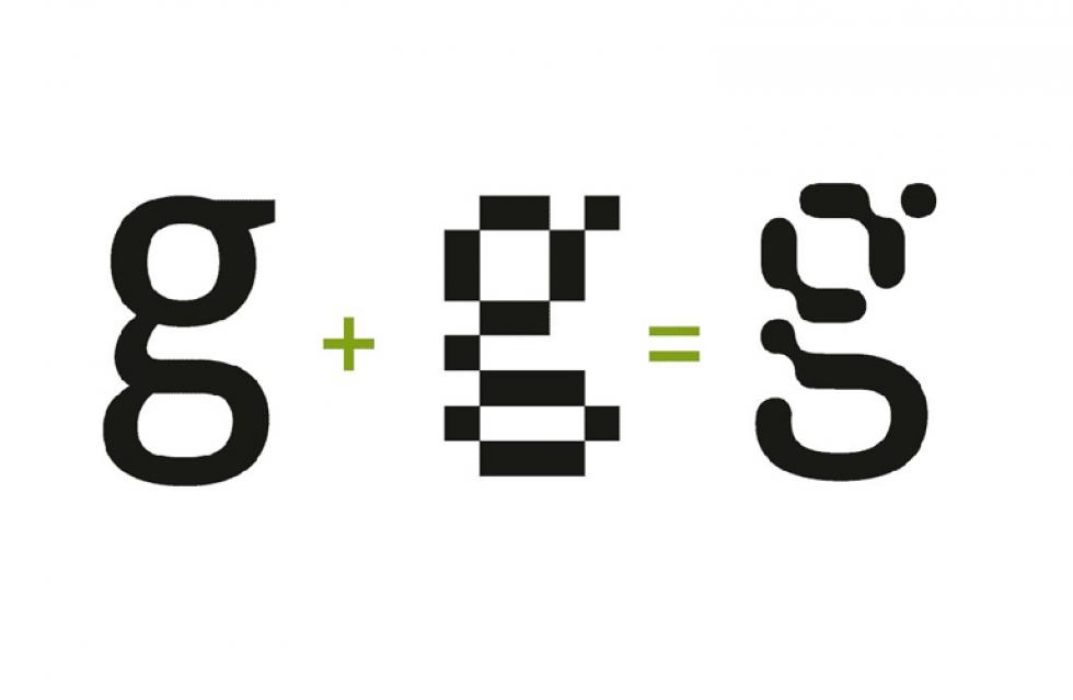
As it gets easier to design, publish and use type online, new words and trends will continue to introduce new fonts and styles to our toolkit. The future is evolving before our eyes, with more applications being introduced, trends being revived and then going out of fashion again. All this allows us to be more experimental and creative, making the future of typography an exciting new discovery.
“There will always be type, and as long as designers like difference, there will always be unusual typefaces for eccentric applications.”
- Steven Heller
Emma Stott
21 July 2015